Moody Vibes: How to Create Depth and Drama with Color and Texture
 Moody design is having a major moment, and it’s not about making spaces feel dreary. With the right mix of color, texture, and lighting, you can achieve rich, inviting interiors that feel sophisticated and comfortable. Here’s how to strike that perfect balance between drama and livability.
“Bringing in deeper, darker tones doesn’t mean the space has to feel dark,” Normandy Designer Ashley Noethe says. “Moody design is all about atmosphere. The key is pairing those bold colors with good lighting, so the room still feels functional and warm.”
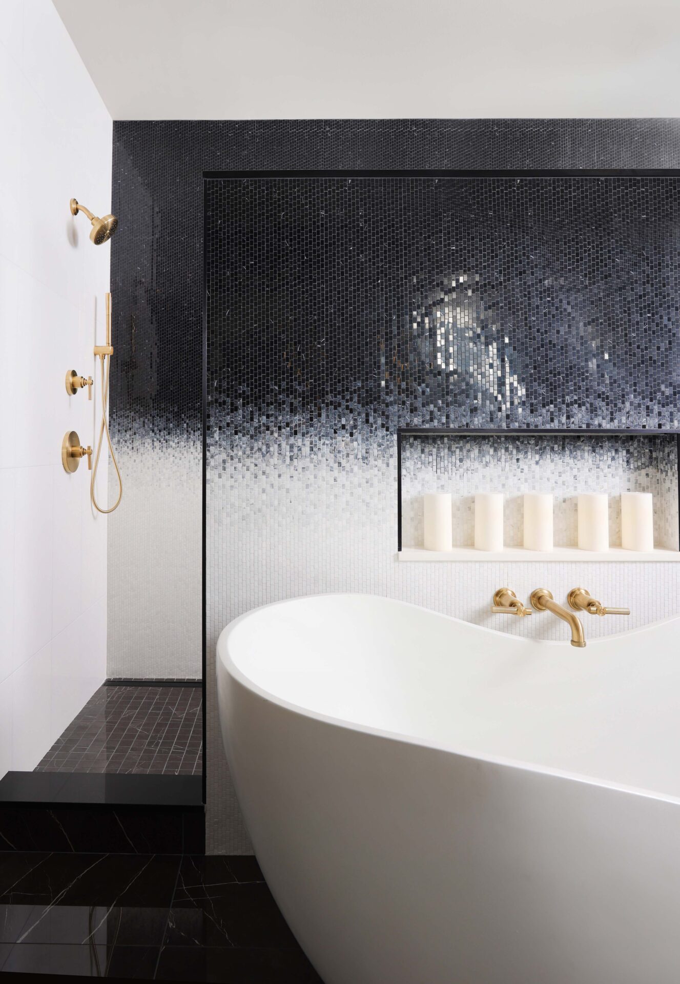
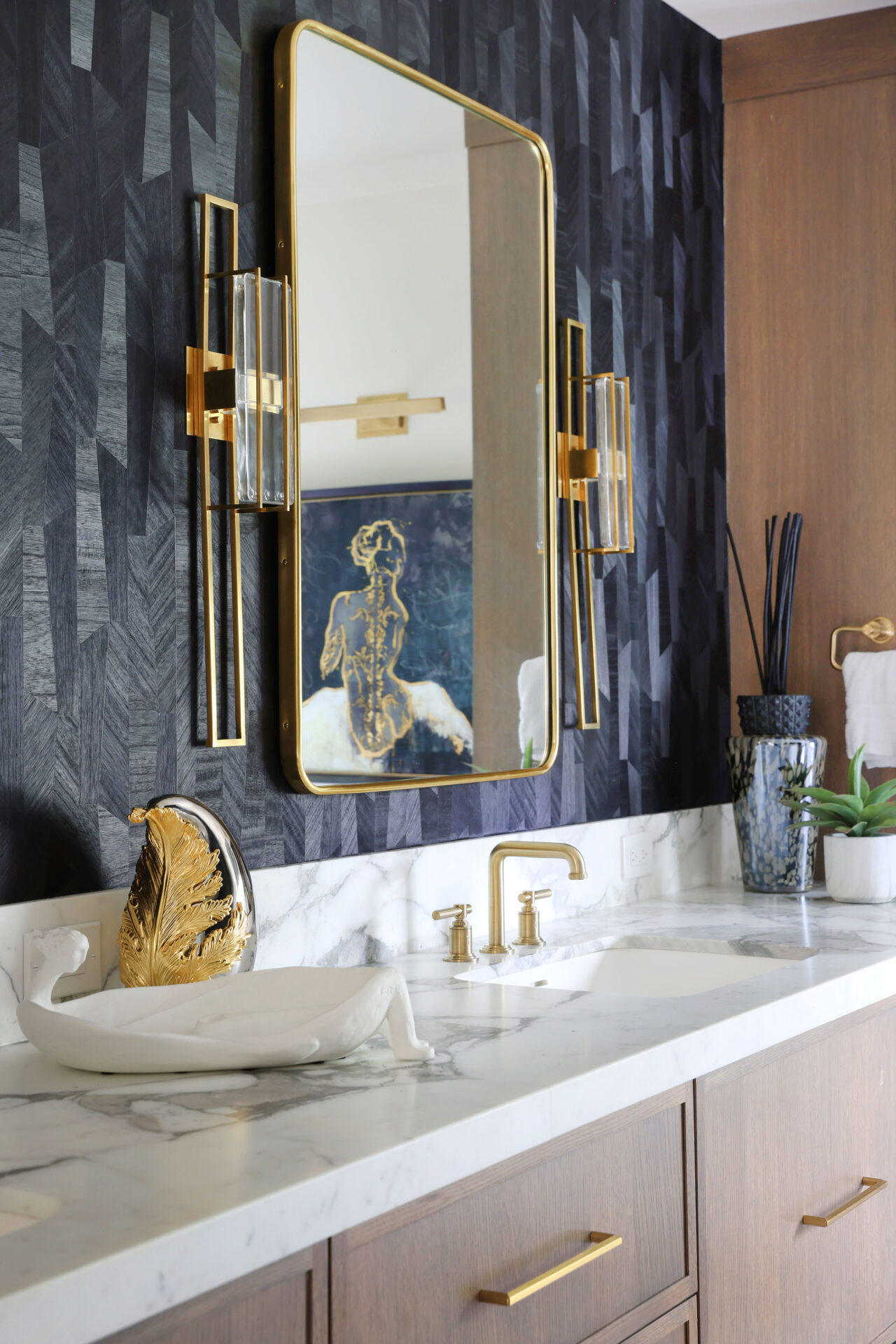
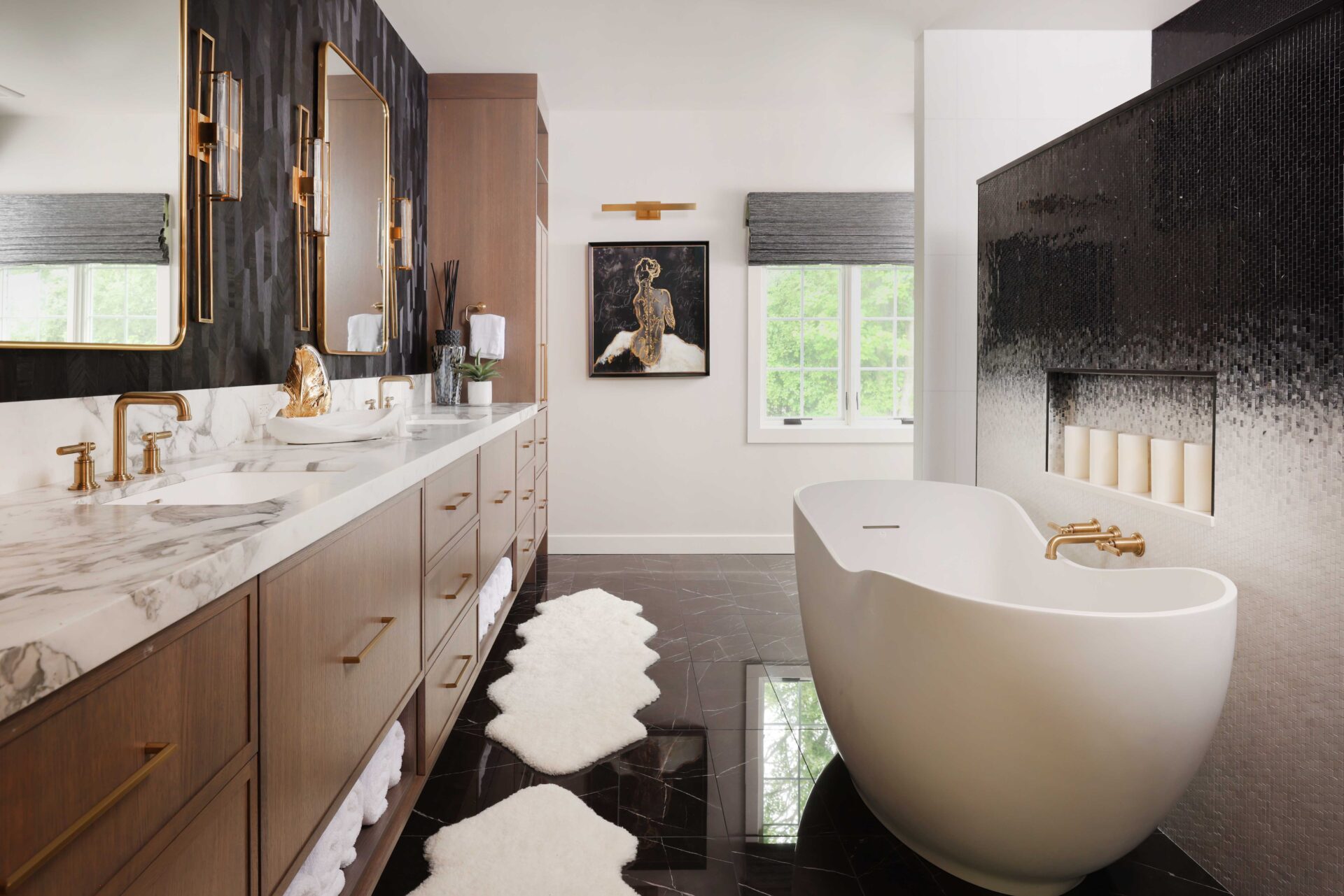
 Lighting is essential when working with darker shades, according to Ashley. From accent fixtures that highlight textured tile to layered lighting that adds dimension, light ensures a moody room doesn’t cross into gloomy territory. “Accent lighting that complements wood grain or tile texture helps bring depth to the space,” Ashley notes. “It’s about playing with scale and finishes so the room feels intentional and balanced.”
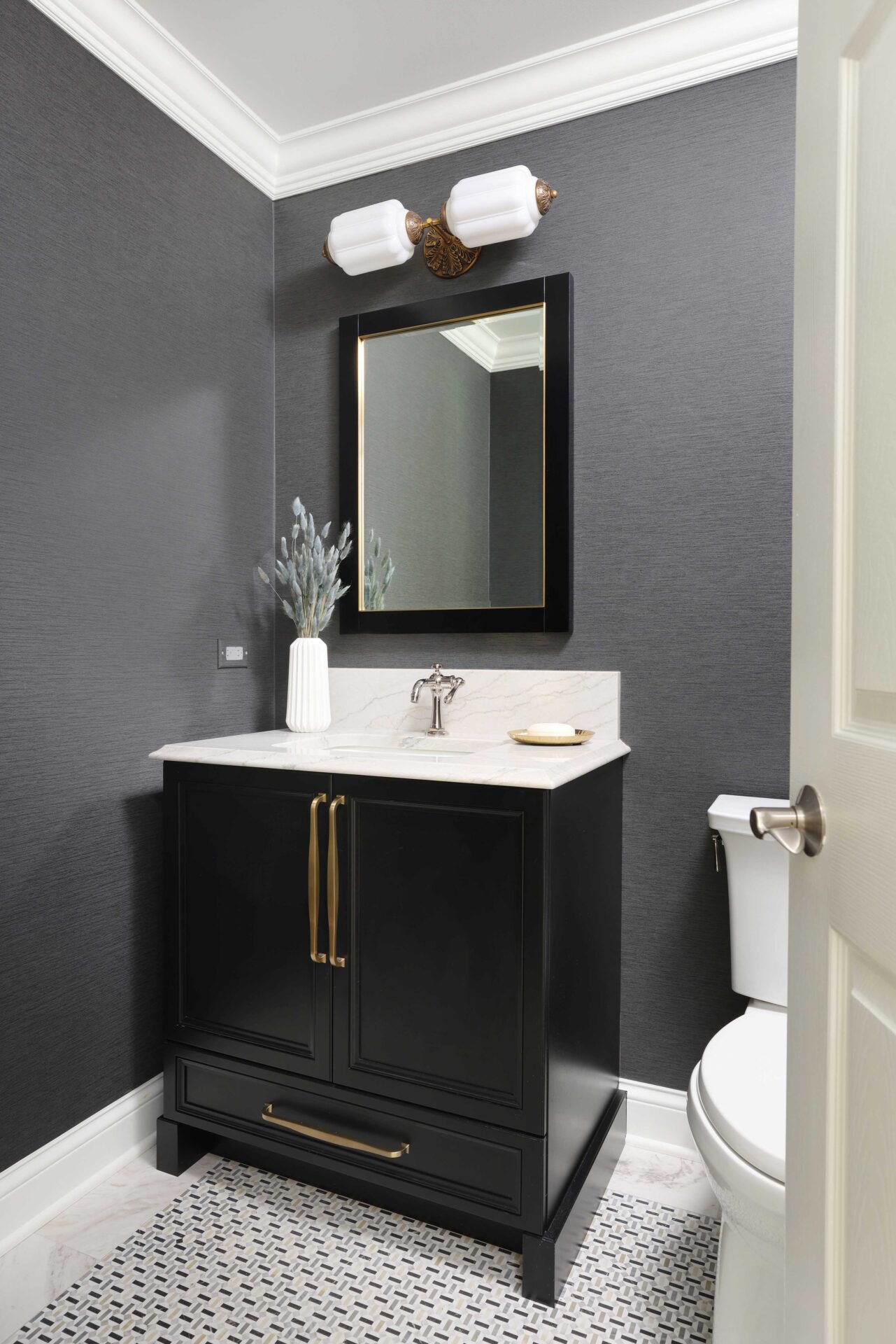
Ashley often combines shades like black, charcoal, chocolate, and deep green to achieve that moody feel without losing contrast. “When you pair darker tones with something lighter, like white cabinetry, it helps each element stand out more,” she says. “If you want a bold, textured backsplash and dark hood as the focal point, consider adding lighter cabinets around the perimeter. The contrast draws your eye to the dark elements rather than letting everything blend together.”
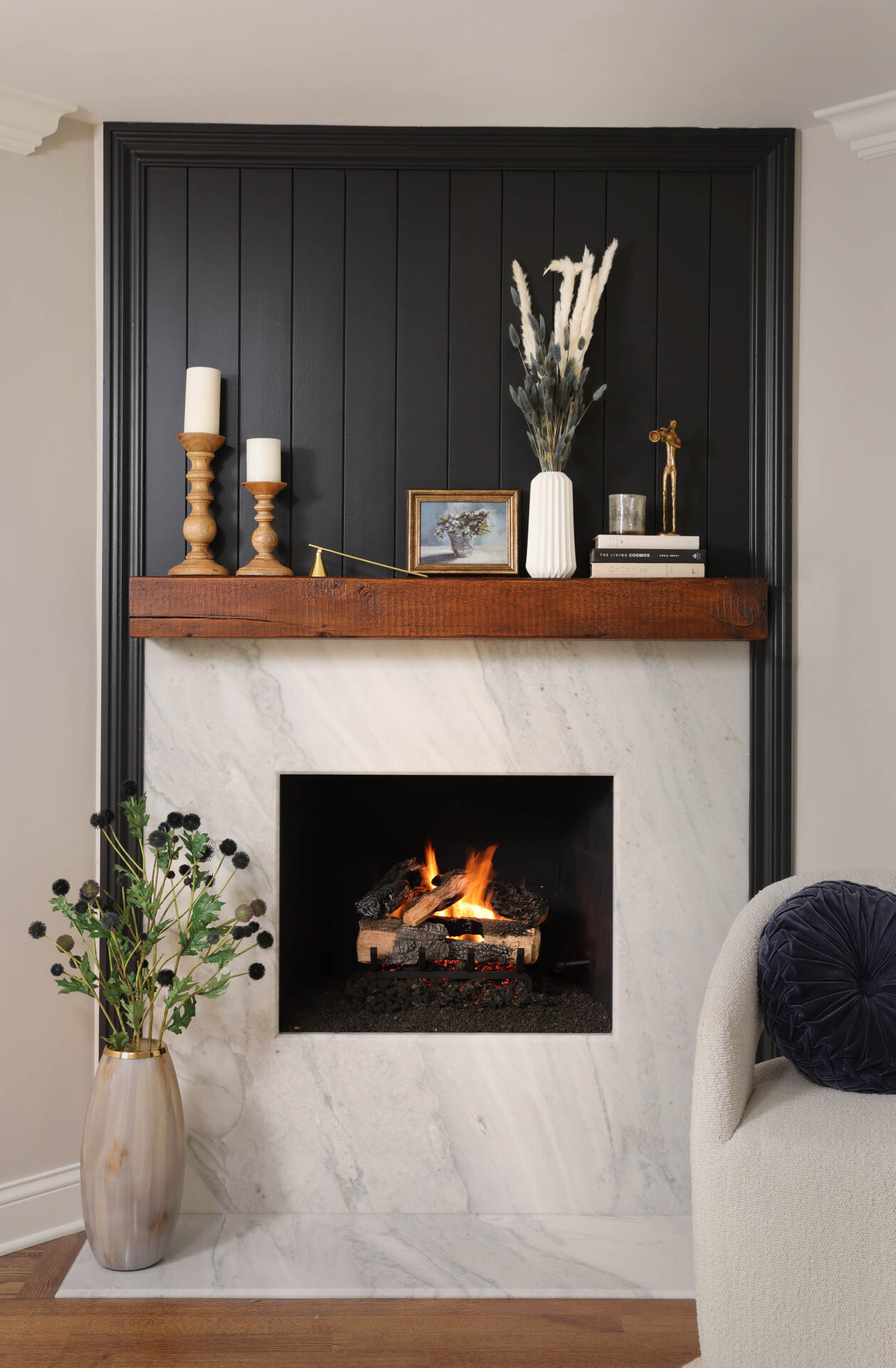
 Another trend Ashley highlights is color washing or color drenching, where walls, trim, and cabinetry are all painted in the same tone for a cocoon-like effect. “Color washing creates such a cozy, immersive atmosphere for any style,” she says. “It’s perfect for bedrooms, dens, or anywhere you want to relax.”
Bathrooms and powder rooms are ideal spots to experiment with moody design. “A powder room is the perfect place to go bold because you generally don’t spend as much time in there as you would a primary bathroom,” Ashley notes. “And since it’s a smaller space, it’s easy to change later if you want to try something different or add lighter elements like painted trim.”
Whether through deep hues, layered textures, or thoughtful contrast, moody design is about creating emotion and depth. “It’s dramatic, but it’s still livable,” Ashley says. “When done right, it feels warm, elegant, and a little bit mysterious all at the same time.”
If you’re looking to revamp your home, set up a time to talk to Ashley about transforming your space into a space that inspires you. Looking for ideas? Click through our photo galleries. Prefer a daily dose of design? We share ideas, photography, and projects on Facebook, Instagram, and Pinterest. Follow along.